Designing a Homepage: Balancing Aesthetics, Functionality, and User Experience with business needs.
Designing a homepage is tricky because you need to balance what users want, technical limits, your brand's style, and how it looks. It can feel overwhelming, but by breaking it down and focusing on what’s best for the user, the process becomes easier. We’ve been designing and re-designing the front door at sallie mae for over 2 years.
A timeline: over the years
The overhaul
Phase 01: 8 weeks to concept, design, and test
Through comprehensive research, three key themes were identified that align with user needs: building trust, offering personalization, and reducing clutter. By incorporating white space, consistent branding, relevant data, and personalized elements, we successfully addressed these priorities.
-
This phase focused on crafting detailed inspiration boards and performing a thorough competitive audit, all while collaborating closely with both our content authoring and research teams to ensure strategic alignment and creative cohesion.
The insights gained from the audit allowed us to identify elements we could eliminate or refine in our own experience. -
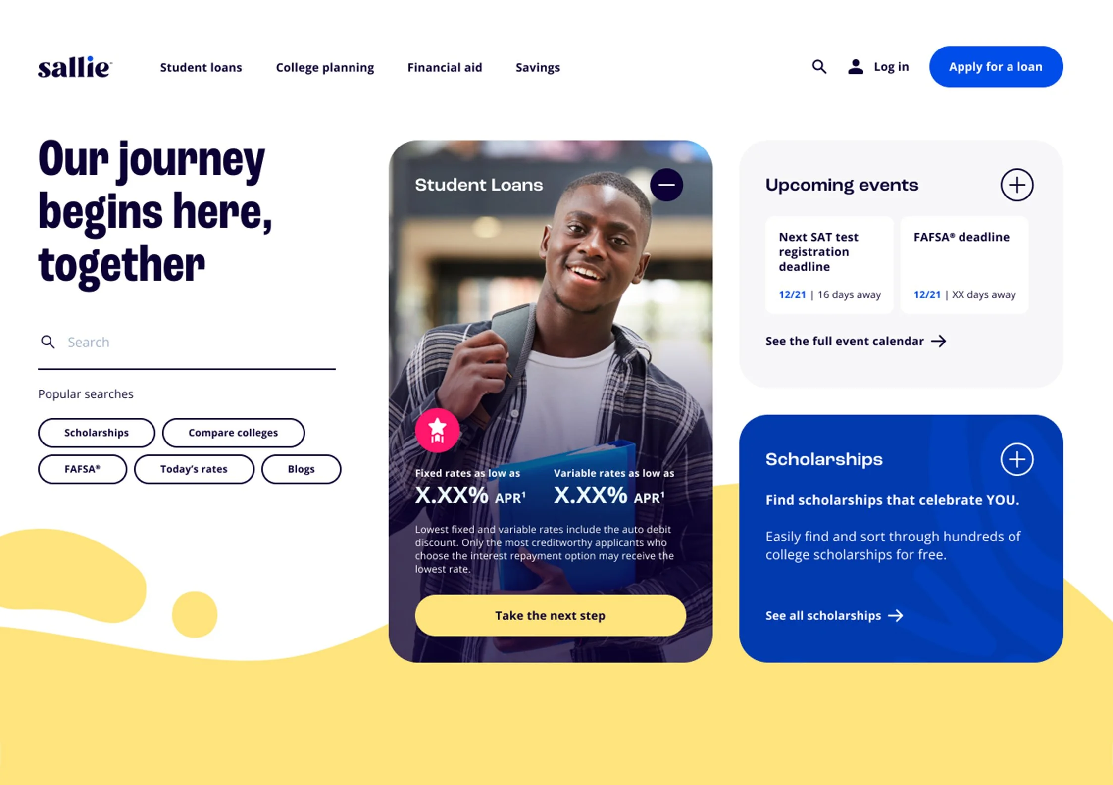
With discovery under our belts, the goal was to develop 2-3 innovative concepts for the homepage, challenging existing conventions. Key questions included: Do we need to display rates? Is photography necessary? How many tools are essential for the user? Which content best aligns with the three themes identified during discovery? A creative brief was formulated, and the team moved forward with developing enhanced experiences delivering on what customers want and need.
-
In order to move forward with a chosen concept, we tested all 3 concepts to find out what really resonates with users.
Objectives:
Evaluate 3 homepage concepts with prospects and customersWhich concepts best represent Sallie, the education solutions company?
What elements stand out as valuable and unique?
How do these concepts impact perceptions of Sallie Mae?
Identify actionable insights to build the next iteration of the winning concept
Methodology
ProspectsUnique AI-powered ‘qual at quant scale’ methodology with our vendor
1-hour conversation with 200 to college and in college students and parents
Customers
Customer survey via UserTesting.com (n=150)
10 one-hour one-on-one interviews via UT.com
General Learnings
The concept of ‘education solutions’ is both appealing and needed
95% of prospects and 93% of customers found the provided description very or somewhat appealing
Participants recognize the site as a one-stop-shop for education financing, not (yet) a true 'education solutions' company whose offerings span the higher education journey
Products outside of the financial category are needed to build this broader perception
Generally, participants report a more positive impression of Sallie Mae as a company who wants to help students and families after viewing these concepts
Some students and parents with negative perceptions of Sallie Mae will need ‘proof’ that Sallie is truly invested in students’ success
There are 2 audience need states: 1) I know what I'm looking for, and 2) I don't know where to start. The concepts do not meet these varying needs consistently.
All tested concepts were received positively
About 9 in 10 participants found the concepts engaging, believable, and made for people like them
Most participants described the designs as appealing, informative, and helpful
-
With a clear direction established, we will consolidate all feedback into a final working prototype, which will then be tested againand refined based on user input.
“It was the most modern and user-friendly, bold colors that catch your attention and had the most upfront information without having to directly search further. It was, as a whole, much easier to process.”
You'll have to reach out to me to see the work as a whole.

The students spoke.
47% chose concept 03
This design focuses on deeply understanding our users and addressing their specific needs during the transition from high school to college. The concept leverages ample white space and features customizable tiles that display content tailored to the user’s journey—whether based on the season, a personalized session, or general information to help them navigate and become comfortable with the knowledge required for college life.

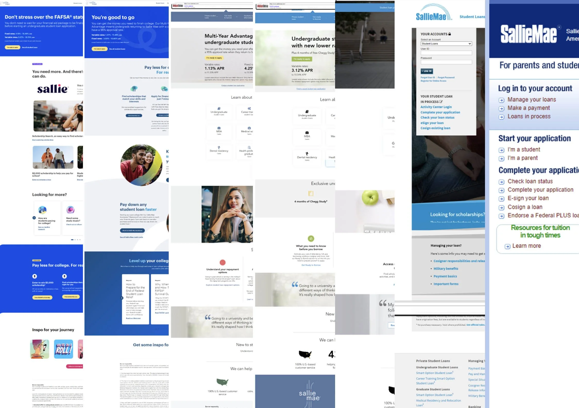
Discovery | Audits
Inspiration boards serve as a visual communication tool, enabling designers to align early with clients on the aesthetic and direction of a project. Paired with a comprehensive competitive audit—analyzing market positioning, strengths, and weaknesses of key competitors—this approach ensures a shared vision from the outset while identifying strategic opportunities for differentiation. Together, these efforts lay a strong foundation for informed, collaborative, and market-aware design decisions.

Concept work
Presenting a range of distinct design concepts—each with its own organizational structure, content hierarchy, and unique value propositions—provides the client with a broader perspective on how their story can be told. This method encourages deeper reflection on the priorities of their brand narrative, helping them evaluate how best to communicate their identity, core values, and product or service offerings. By exploring different pathways for user engagement and message delivery, clients are empowered to make more strategic decisions about the tone, structure, and emphasis of their digital presence.

Initial research findings
Concept testing is a critical step in understanding how well proposed ideas resonate with target audiences before moving into full development. It helps validate assumptions, surface potential challenges, and refine key elements such as messaging, design, and functionality. In our case, the results strongly affirmed the strength of our research and upfront strategy. The concepts tested aligned closely with user needs and expectations—reinforcing their viability in the market. Notably, one concept emerged as a clear standout, demonstrating exceptional potential for success.